Showing posts with label Making. Show all posts

Final poster and poster in context.

Final poster and poster in context.
Making.

Having the final text as 'I am who I am, but not what you think', I feel that without repeating the image it clarifies the message because it creates a statement that can potentially challenge people.

I feel that the poster fits in quite well because it's not lost with it's dark colours but with a few brighter ones around it allows it to be drawn out and with a few subtle changes it looks realistic.

Text experiments and changes.

Thinking of different tag-lines.
Define, Ideate, Making.

I decided to change the text because the 'Who am I?' question didn't exactly show what angle I was pitching my idea from making it void therefore a statement is more suitable.  I wanted to create text that didn't retell what the image was but to top off the image and make it absolutely clear.


'I'm not who you think' works as a statement but I feel that it feels like there's something else that needs to be said because it seems to be a bit open and unfinished.

Minor tweaks of development.

Minor changes on one development so far.
Making.

Here I was mainly working on alignment of text in the image, seeing where the eye was drawn and how the hierarchy worked visually.  I wanted the image to remain the focal point with the text secondary but I came to notice at the end that the red box in the image overpowered the red silhouette. With bottom right text placement it allows us to read naturally left to right and to guide us down the page.


Development of chosen ideas.

Development of chosen ideas.
Making.

I chose two concepts to work with, the android design and the false identities idea.  I chose the android idea because in a nut shell it is a strong idea and the relevance it has with now days with the effect it is having on our societies.  The false identity idea is prominent these days as people are becoming less confident in themselves and like how they look on virtual networks that they need to create false identities to boost their confidence.
Idea 1. Android influence 
Initial Concept.


Above is a simplified version of the initial concept turned landscape to get central image spread out. There are some colour variations of the initial idea with a few added technological pieces and one banana for the chimp!  However I don't feel that there is much potential with this idea because there would only be minimal possible changes.

Idea 2. False Identities 
Initial Concept.


I played with the idea of shadows and the person casting the shadow having different identities to represent that one person can and will have more that one identity virtually if they feel insecure or are fearful.  I decided to work with different colour schemes as well to see if other colours and variations of colour effect the meaning. From these designs I believe that i will be able to create compositions that clearly show how people are forgetting who they are because of their many false profiles.

Interim presentation.

Interim presentation and critique.
Making, Critique.

In the class today we shared our posters to our peers and tutors.  From these critiques I gained a lot of things that enable me to be able to add value to my work both with communication and aesthetically.  I also dropped one of my ideas as the potential wasn't as much as the other two.

Development of ideas.

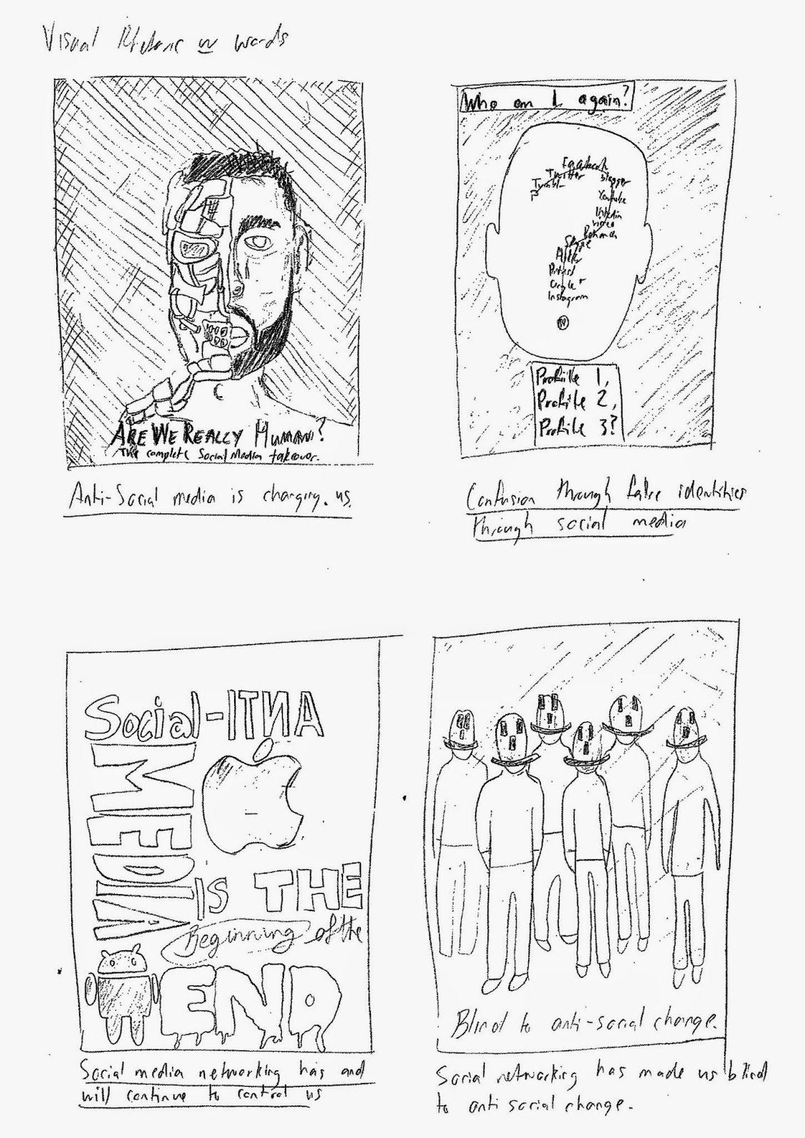
Development of certain ideas.
Making.

I had to chose 4 ideas that I created and take them to the next step.  With the following I feel that they're the strongest ideas and in terms of clarity are communicated well.

First concept development


One of the ideas that I decided to develop was how social media is turning us into robots.  The design was where the face was half human, half robot showing how we're changing individually and as a society.

I started off designing some half humans half robots as shown in the 'Experimenting with ideas and imagery' post.  With this I was trying different techniques with different people, trying to get an affect that best suited my idea.  After choosing the vector design I developed it further, adding more to the image.
I created three similar designs that all communicate the same idea just different variations and different compositional layouts.

Second concept development


Another idea that I am developing is much like the above but in different terms in showing the actual technological pieces affecting us, not the programmes.  I decided to go with the android over the apple because of the practical benefits.

Social media has allowed us to create false profiles about ourselves which can have a negative effect on us because the lack of truthfulness is becoming prominent.  Over confidence is rising through social media allowing certain people to use that over confidence in reality, but realistically they're not as good as they say they are.

I feel that these poster designs are a success because the message that i'm trying to communicate comes across and the text wouldn't need to be there for certain ones.  With change being the main focus here I believe that through the 'half androids, half humans' it is coming across well here.

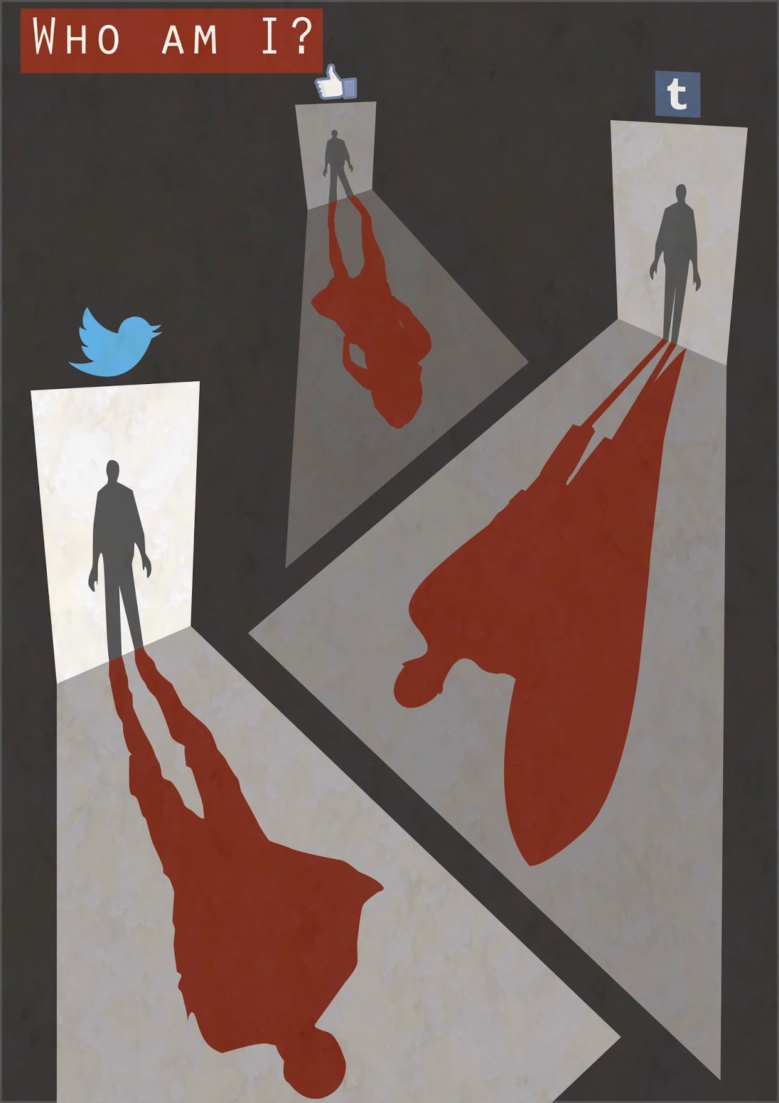
Third concept development


The whole idea of fabricated identities created through social media is quite a large happening because people are feeling insecure, scared or just want an account to do what they want on it.  It is so relevant in todays society that it is a pressing issue because people are taking it to the next step, and are beginning to use false profiles to disguise themselves as other people for security and to hack accounts. 

I decided to choose this idea because people make so many different accounts that they can forget which profile is which person so in a sense they potentially get confused with who they are if they spend enough time on false account. 

Fourth concept development


My visual rhetoric ideas.

Using my ideas to make some visual rhetoric designs.
Ideate, Making.

From my initial ideas I chose the best ones and visually improved them.  I was trying to make it easier to read and to create an image that is more than just stick figures.  Finding the right statement for the idea was quite tricky and I wrote one that I felt suited the image.

I feel that as a platform to go off these work well and from here I feel I'm able to develop some of them further and really produce good posters for interim.  The only problem with a number of them is that they're quite literal so I will continue and try to make them metaphorical.


These 3 ^^^ are more thought out and better presented ideas.

Experimenting with ideas and imagery.

Continuing poster designs and feedback session.
Define, Ideate, Making, Critique.

I decided to work on the imagery for one of my ideas because I thought this idea could thrive with the right imagery.

This idea was that due to technology we have changed and become more like 'robots' so to speak because we are now programmed to check out cellphones straight away if we get a message or a call that can even interrupt conversations or intrude on dinner time.  Even if the phone doesn't go off people aren't reluctant to pull it out and check it "just cos", which can be invasive on conversation.
This is the initial idea that the following designs are based off.


These three ^^^ are experiments with different people (one being Mark Zuckerberg(Facebook founder)) and how it works with people instead of drawings etc.
I quite enjoyed making these and feel that with some added visuals it could become strong compositions.  The only negative thing I got from this was the amount of time it took to create them; this could potentially turn me away from this idea because I need to plan the time spent to create maximum efficiencies.